StreamNet Product Design
UI/UX Design for streaming video app
The Problem
Users find themselves in a challenging position when their favorite titles disappear from their saved watchlists. As streaming platforms continue to cut costs, many viewers are left with this confusing void. The other frustrating part of this has users searching for their missing titles on other platforms or elsewhere on the web.
The Solution
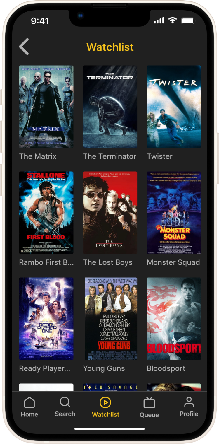
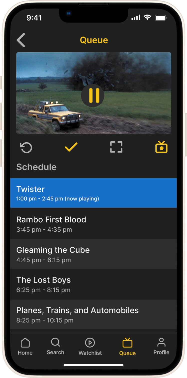
StreamNet is an app that allows users to have the option to watch all their streaming titles, plus watch the titles which are unavailable to them, through a streamcast feature, from other users they follow on the app. On StreamNet, viewers have multiple options to watch their favorite movies and shows from a variety of streaming platforms with a community of like-minded viewers.
Secondary Research
To better understand the problem, I conducted secondary research which confirmed that streaming titles are constantly being removed from user watchlists on all streaming platforms. My research uncovered two main reasons for the ‘disappearing’ of titles.
• Cost cutting due to licensing expenses making certain titles unprofitable to streaming services.
• New subscriptions are the main priority for streaming services.
• New subscriptions are the main priority for streaming services.
Primary Research - Research Plan
For my primary research I wanted to gain more knowledge about disappearing titles and the struggle users face trying to locate them after they’ve been removed from their streaming services.
To do this I conducted screener surveys to recruit participants, and I interviewed them to learn more about their individual experiences. With the data I collected I synthesized my findings into affinity groups, empathy maps, and personas.
Screener Survey
During the screener survey my main focus was to find users to interview who have experienced watchlist titles disappear from their streaming platforms, and acquire knowledge of the actions they’ve taken to locate them on other platforms.
Interviews
Five participants were remotely interviewed via Zoom, so that I may learn more about the experience users were having with titles disappearing from their streaming services, and to learn more about the actions they take to look for and find missing watchlist titles.
Affinity Mapping
After the interview process I created Affinity Mapping to identify and organize the following five categories, feelings about missing titles, experience with current streaming subscriptions, reactions to missing titles, likes about streaming services, and dislikes about streaming services. This was helpful in my process as it began to narrow down the challenges users were having into identifiable groups.
Empathy Mapping
Empathy maps were created to further narrow down the focus on the users and their attributes as it relates to their reactions to this issue. Two types of users were identified during this process, the loyal subscriber and the money saver, and this was helpful in getting to know the differences and commonalities between user groups.
Personas
The next step was creating Personas which really filtered down the empathy mapping into two users and their specific characteristics. This was helpful to better understand who to accommodate the decisions for when designing the app.
The Money Saver - is a college student in his early 20’s who works part-time when he’s not in school or studying. He likes watching his favorite movies and shows on his smartphone from anywhere. He subscribes to one or two streaming services because that’s all he can afford, but he does appreciate the low monthly cost and the visual quality of the media.
The Loyal Subscriber - is a marketing professional in her 30’s who leads a very busy life and doesn’t have too much time to stream her favorite movies or shows. She can afford to subscribe to two or more streaming services to maximize her viewing options. She appreciates a library of older shows as well as new and original titles.
How Might We
The next portion of my research included How Might We (HMW) statements to clearly identify the most challenging issues users want to solve.
• How Might We relieve the frustration of titles disappearing from subscriber’s watchlists?• How Might We make available selections not feel overwhelming to a subscriber?
• How Might We help users view all of their favorite movies and shows in one location?• How Might We help users trust that they are receiving personalized recommendations?
• How Might We help users view all of their favorite movies and shows in one location?• How Might We help users trust that they are receiving personalized recommendations?
Ideation
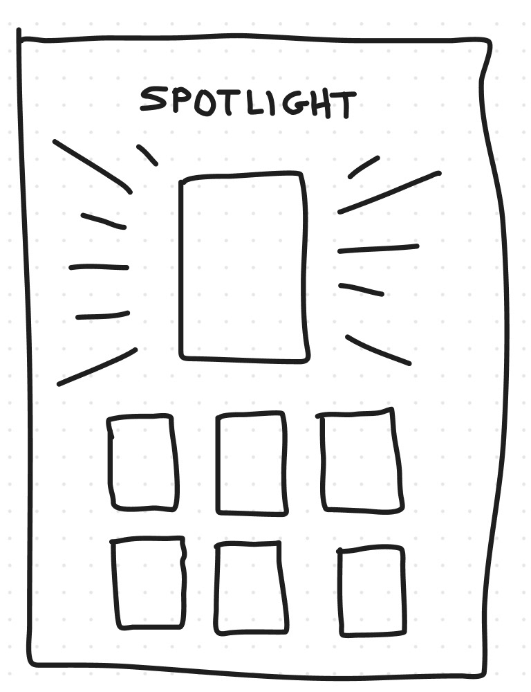
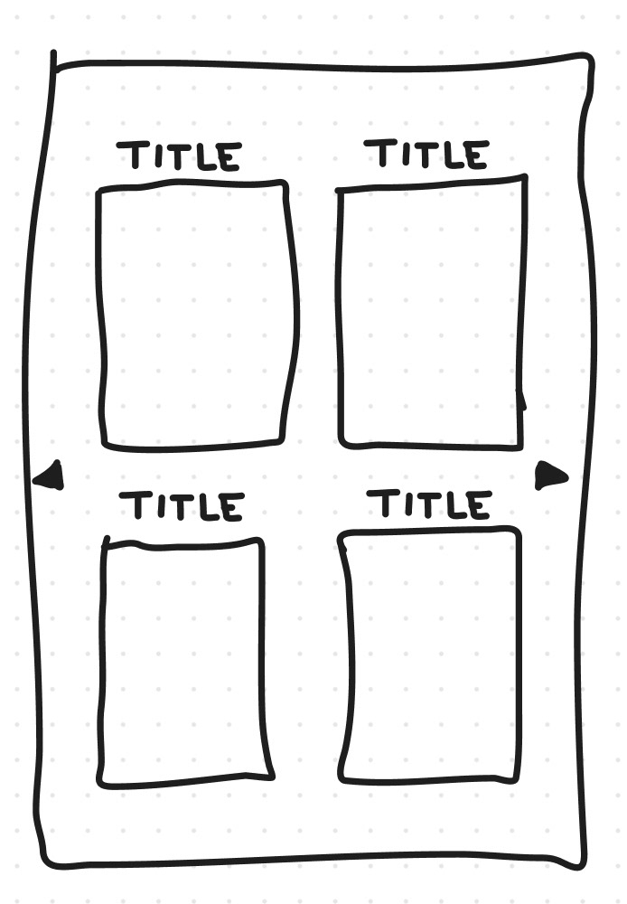
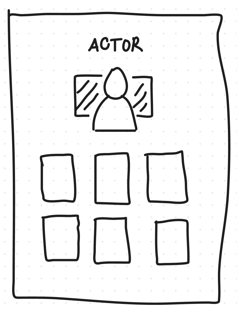
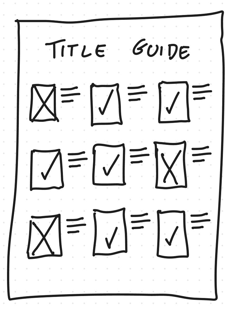
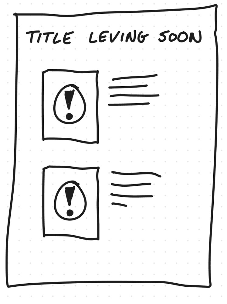
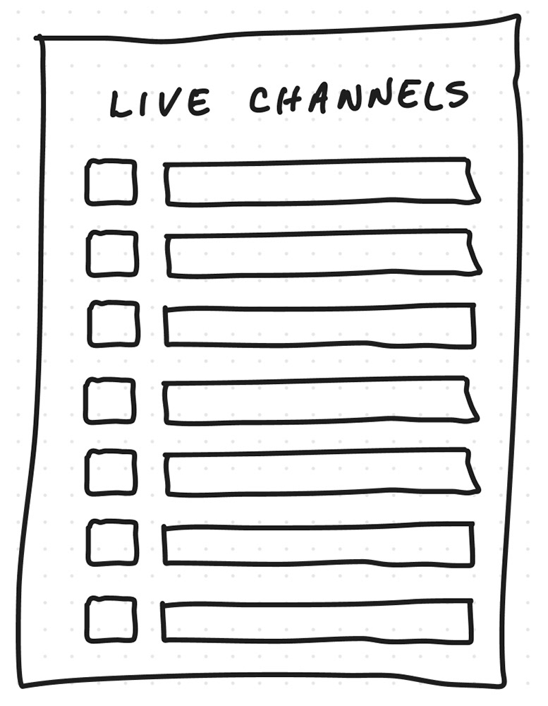
After identifying the How Might We statements, I was able to move forward with ideation and create sketches of the screens which illustrated solutions to the problems identified by the users. I came up with the sketches as a rough implementation of the screens that I thought were necessary for the users to find the most important points of action. By creating rough sketches I began to understand how the UI would begin to take shape, what was possible to do, and get a concept of how much space I had to work with.
User Stories
After conducting interviews and research, I was able to gather all the necessary functions that users required for a successful experience. By creating the user stories, I was able to formulate these requirements and organize them in a way that made the most sense. The following are the highest priorities:
As a user, I want to:
• Find all my favorite titles in one place, so that I can save time searching for them elsewhere.
• Find my favorite titles not to disappear, so that I can continue watching them.
• Be able to watch on any device, so that I can stream my favorite movies and shows from anywhere.
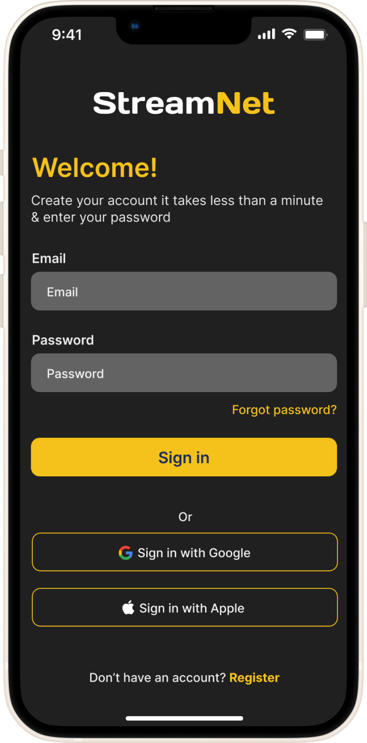
• Be able to create an account, so that I can manage my profile
• Be able to adjust my settings, so that I can personalize my content
Sitemap
Creating the Sitemap really helped me see the hierarchy of the pages, and the intended path to help the user easily navigate the app. This higher level gave me a better view of the user journey.
User Flows
After creating the Sitemap I was able to identify three main User Flows that would allow the user to begin watching their favorite titles on the app. By creating these user flows I was able to identify the quickest and easiest paths for the user to arrive and begin streaming their desired titles. I was able to determine this by the feedback I received from the interviewing process.
Sketches
These sketches were a quick and early iteration of the app, and I was able to begin to see the user flows come to life from the point of view of the user and understand the thought process better with the layout on the page. This allowed me to begin to think of the intended interactions with each element on the page.
Wireframes
With these wireframes I was better able to understand how much space was available within each frame and how to best organize each component that made the most sense for the app on the respective page. With these wireframes I was able to establish a structure that made the most sense for the app.
Mood Board
The inspiration for the mood board came from the mutual enjoyment users have with their favorite streaming titles. With StreamNet being an app which will unite the streaming audience, it was important for me to know how to represent this app with the following attributes: united, versatile, dependable, and interactive.
With one place where all viewers can come together to stream the same titles, this mood board visually represents the unity, enjoyment, and camaraderie of this new streaming community.
Brand Personality:
StreamNet is an organized individual who likes to have everything in one place where it's easy to find. Additionally, it enjoys the camaraderie of like-minded people and above all, it appreciates quality and variety in their entertainment.
StreamNet is an organized individual who likes to have everything in one place where it's easy to find. Additionally, it enjoys the camaraderie of like-minded people and above all, it appreciates quality and variety in their entertainment.
Rationale:
This personality embodies the community of people who have a common bond, and formed a culture around streaming their favorite movies and shows. Currently, viewers are divided between platforms based on how many subscriptions they can or can't afford.
This personality embodies the community of people who have a common bond, and formed a culture around streaming their favorite movies and shows. Currently, viewers are divided between platforms based on how many subscriptions they can or can't afford.
Imagery Inspiration
• I chose these images because they felt warm and connected
• When users see this imagery they should feel a sense of unity
• This imagery is very fun and entertaining, and should make users feel enthusiastic about being surrounded by each other.
UI Inspiration
• I chose these images for UI inspiration because they are organized and use color backgrounds which allow the videos to stand out
• I find the colors visually soothing and consistent throughout each page
• I also like that these images have a clear visual hierarchy
Prototype
With the Hi-Fi wireframes created in Figma, I decided to also create the prototypes in Figma. This allowed me to connect the elements on the page to their respective destination and experience how the app would work in a live scenario within the same space they were created.
Usability Testing
I conducted remote usability testing of the prototype for my app StreamNet was through five participants via Zoom screen share to observe the usability of the 3 main user flows:
1. Searching for a movie title
2. Saving a movie title to the Watchlist
3. Watching a selected title from Watchlist.
Testing Objectives
The objective of the usability testing is to discover any issues or confusion that users may face while using the application, and to understand how these issues may be resolved through future development.
• Are users able to easily search for a movie title?
• Are users able to add a searched movie to their watchlist?
• Are there any challenges in searching for a movie title?
• Are users able to watch a movie from their saved watchlist?
• Are there any challenges in watching a watchlist movie title
Testing Results
Users expressed an interest in the natural flow of the app during the usability testing sessions. However, the following top 3 results were discovered, and categorized by importance, for the next iteration of the redesign.
Primary Issue
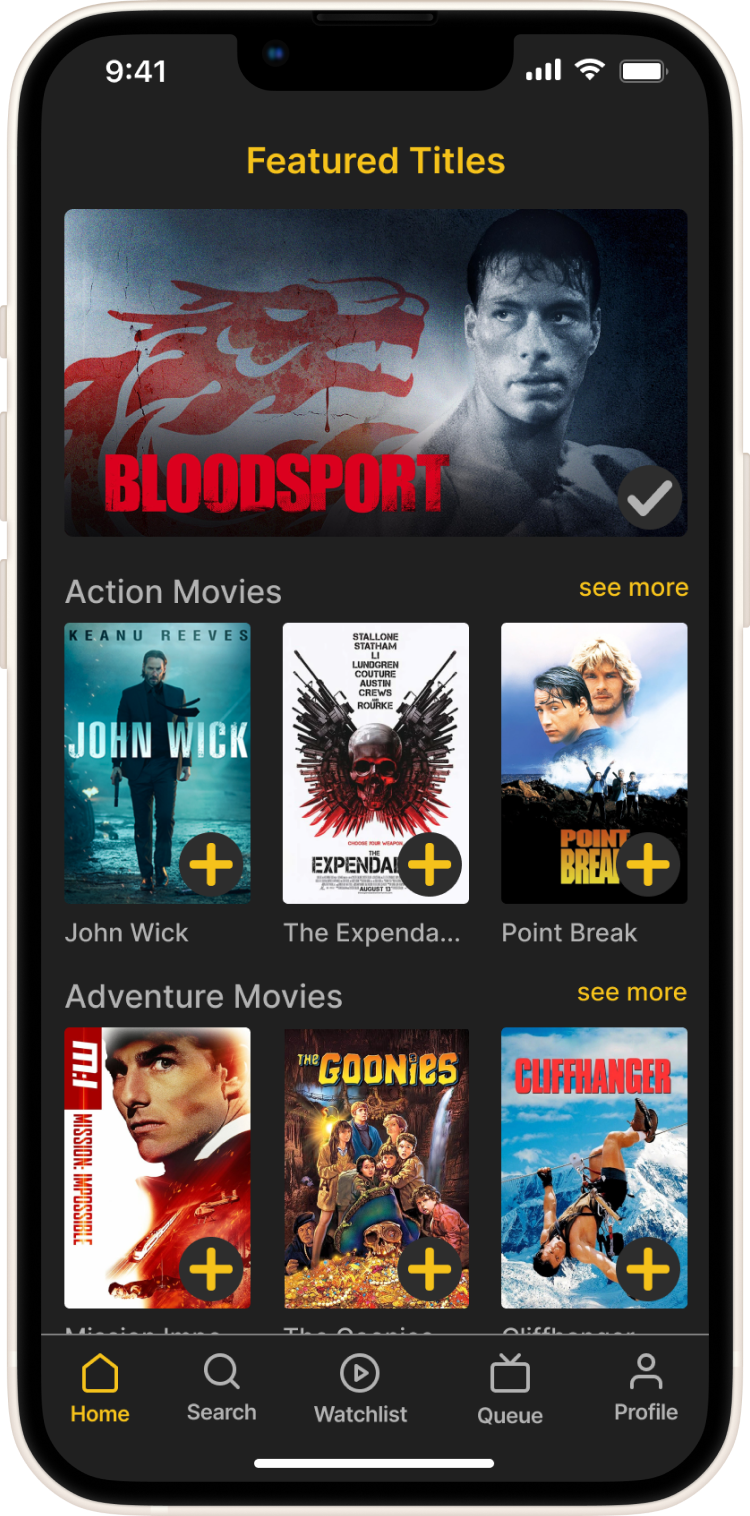
The main finding was the need to allow the movie thumbnail to be clickable and link to the movie title page.
Summary
1. 5 out of 5 users required the option to navigate to movie title page from suggested movies
2. 4 out of 5 users looked for other ways to find the movie title page
3. 3 out of 5 users navigated to the search as an alternative option
Recommendations
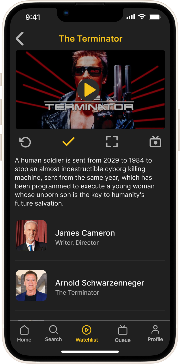
• Link movie thumbnail to the movie title page
• Include option on the movie title page to add movie to Watchlist
• Include navigation to return to the previous page from movie title page
Secondary Issue
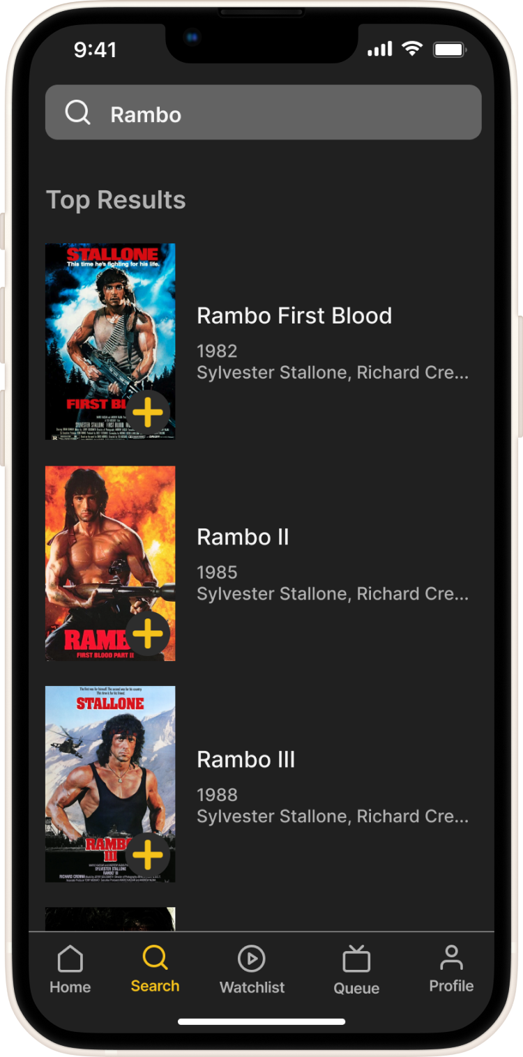
The second finding was the need to have an option to ‘add movie’ to the Watchlist from the search results page
Summary
1. 3 out of 5 users verbally struggled to add the searched movie to the Watchlist
2. 4 out of 5 users returned to the previous page when arriving on the search results page
3. 2 out of 5 users navigated to Watchlist to see if movie search already saved to Watchlist
Recommendations
• Include option to add movie to the Watchlist from search results
• Link movie thumbnail in search results to movie title page
• Provide option to add movie to Watchlist from movie title page
Synthesizing and Redesigning
After the usability testing I was able to gather valuable information on how to make proper adjustments to the design. The main three findings included having a link from the featured titles to their respective movie title pages, the need to have an option to add a movie title to the watchlist from the search results page, and to update the title of the ‘Channels’ to ‘Queue’ in the navigation.
The following solutions were implemented into the redesign of the final product:
Conclusion
I am so grateful for the knowledge I've gained throughout this process. I now have a major appreciation and an invaluable understanding of every aspect of UI/UX design, from identifying and researching the problem to adjusting the final design based on user feedback. At the beginning, I was surprised to see this project unfold in so many ways and on so many levels. Designing and prototyping were my favorite parts of the project. And interviewing and usability testing were the most challenging. But as a result of the thorough research and testing, I’m happy with the final product. It is undeniably complete and created to meet the expectations of the users it was meant to serve.
Now that the app has made it to this stage in its development, I know that it will continue to undergo updates and edits that will carry it forward and improve its performance as it has from the very beginning. I am very proud of how far this app has come on its journey, so far and I’m looking forward to seeing where it goes from here.
